The modern retail environment is evolving rapidly, and one often overlooked element plays a monumental role in both consumer experience and brand impact—retail logos. Whether viewed from eye-level on a shelf or from a distance down an aisle, logos serve as powerful visual anchors. Their visibility and recognizability can make or break a purchase decision in a matter of seconds.
TLDR
Retail logos are essential for brand visibility and customer recognition. The way logos are designed to work on shelves and aisles can significantly influence buying behavior. Innovations in graphic design and AI-driven recognition are reshaping how logos function in-store. Creating logos that pop both up-close and from a distance is now a crucial aspect of retail strategy.
Why Shelf-View and Aisle Recognition Matter
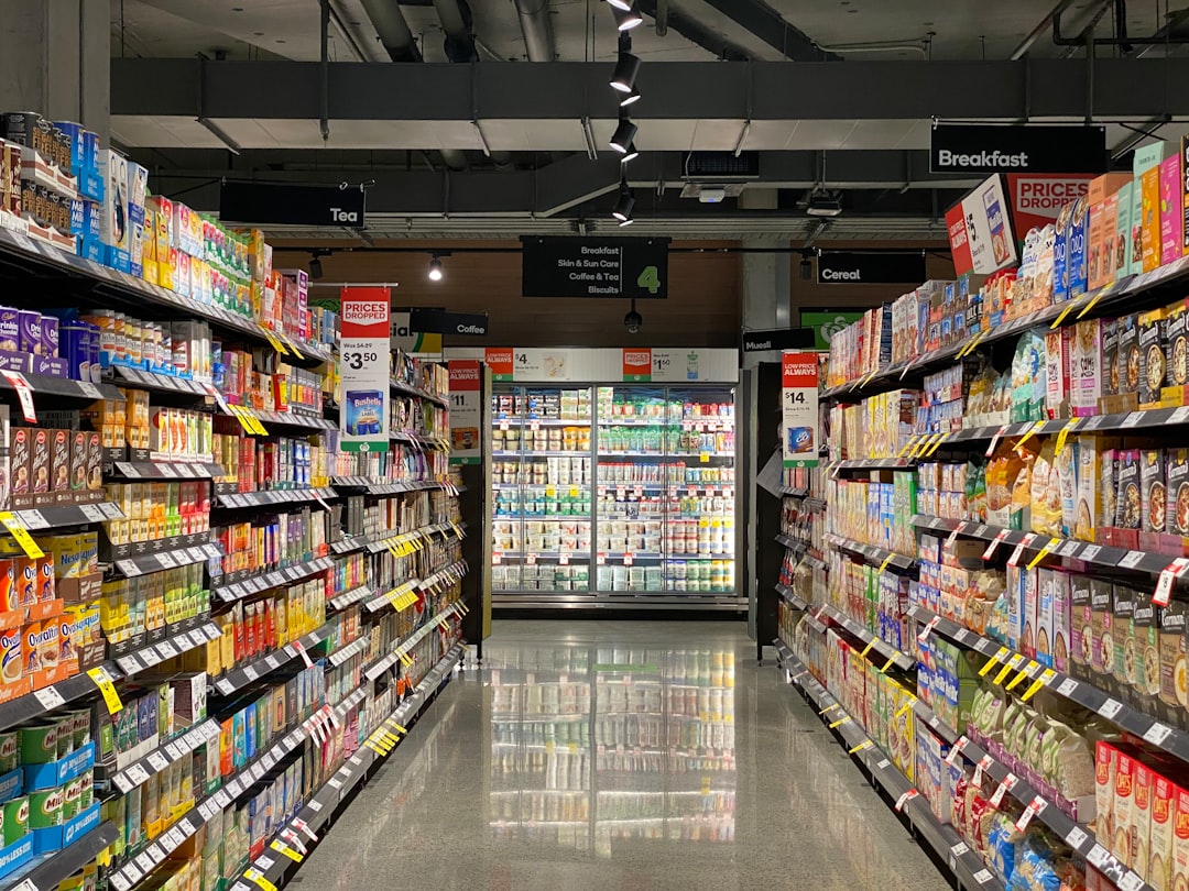
Consumers are inundated with thousands of visual cues every day while shopping. Within this sensory overload, logos play a vital cognitive shortcut role for identifying brands quickly. Many brands invest a significant share of their marketing budget into ensuring their logos are effective from multiple perspectives—especially from:
- Shelf-view: How well a logo stands out when the product is placed on a shelf, usually at eye level or slightly lower.
- Aisle-view: How recognizable and attention-grabbing the logo is from a few meters away as a shopper walks through an aisle.
Understanding and optimizing both of these perspectives ensures that brands don’t get lost in a sea of competitors.
The Psychology Behind Logo Perception
Effective logos trigger both emotional and rational responses. On a psychological level, the human eye is particularly responsive to shape, color, and contrast. Here’s how these elements work together:
- Shape: Simple shapes are easier for the brain to register and remember.
- Color: Unique color schemes can help a brand claim visual territory (e.g., Coca-Cola’s red or Tiffany’s blue).
- Contrast: High contrast between background and logo makes it pop, crucial for shelf placement.
Brand familiarity is another powerful factor. A well-established logo enjoys almost instantaneous recognition, providing comfort and reducing decision-making time for habitual buyers.

The Importance of Scalability and Versatility in Logo Design
Retail logos need to be designed with multiple formats in mind. A logo must be recognizable whether it’s printed on a tiny jar label or stretched across a shopfront banner. Scalability ensures that a logo maintains its integrity and clarity regardless of size, while versatility means it functions effectively in different color combinations, materials, or lighting conditions.
Key principles for scalable and versatile logos include:
- Using vector-based designs that preserve resolution across sizes.
- Creating logo variations—full, simplified, and icon-only versions—for varied use cases.
- Testing visibility in mock environments both close-up and from afar.
Shelf-View Optimization
On the retail shelf, products are fighting for limited attention spans. Consumers often spend less than 5 seconds scanning a section before making a selection. To outperform the competition at shelf-view, brands should consider:
- Clear typography: Fonts should be readable from at least a few feet away.
- Smart placement: Positioning the logo in the upper third of the product’s packaging helps visibility when items are stacked.
- Directional design: Create logo layouts that guide the eye naturally to the brand name.
Color contrast is particularly crucial at this level, as it needs to cut through the visual clutter of the shelf.
Aisle Recognition Strategies
When a shopper enters an aisle, their attention is divided across dozens of brands and product categories. A logo intended for aisle-view must act like a beacon. Here’s how brands are mastering this perspective:
- Large-scale identity: Use oversized logo elements on packaging facing outward on the shelf.
- Bold contrast: Amplify primary brand colors and minimize background distractions.
- Consistency: Uniform logo placement across all SKUs reinforces familiarity.

For example, detergent brands like Tide or cleaning names like Mr. Clean utilize high-saturation colors and big, blocky fonts that maintain their legibility from across the aisle.
Technology’s Role in Logo Visibility
Artificial Intelligence and computer vision are playing growing roles in how brands evaluate and refine the visibility of their logos. With shelf-scanning apps and in-store analytics, brands can track data on how easily their products are being noticed and picked up by shoppers.
Some companies are now using AI tools to:
- Heatmap attention zones in packaging design.
- Simulate real-world visibility in 3D shelf and aisle simulations.
- Test A/B logo variations before launch in real-time virtual environments.
This digitized feedback loop enables brands to iterate more quickly and accurately, often reducing the time between design and rollout.
Common Mistakes and How to Avoid Them
Despite best efforts, many retail logos fall short due to easily avoidable design pitfalls:
- Overcomplication: Too many details, gradients, or embellishments become illegible at small sizes.
- Inconsistent branding: Using different logo versions across product lines confuses the shopper.
- Ignoring color psychology: Choosing trendy colors that don’t align with the brand’s message or product category.
Staying rooted in brand identity while optimizing for exposure makes the difference between a logo that fades into the background and one that consistently attracts the buyer’s eye.
Winning Examples in the Market
Some brands excel in both shelf-view and aisle recognition. Here are a few noteworthy examples:
- Coca-Cola: Its red-and-white color scheme, script font, and consistent bottle shape create immediate recognition.
- L’Oréal: Uses prominent black and gold layouts that resonate luxury while being easy to spot from a distance.
- LEGO: Its bright red logo with bold yellow font is unmistakable from any angle, especially appealing to its young target demographic.
These successful companies share a focus on clean design, consistent application, and emotionally resonant imagery.
The Future of Retail Logo Design
As stores evolve—with digital kiosks, automated checkouts, and smart aisles—logo design will need to keep pace. Future trends include:
- AR-enhanced packaging: Logos that trigger animations or product details via augmented reality.
- Dynamic LED displays: Logos that light up or adjust based on customer interaction data.
- Sustainability integration: Logos and packaging designed to use less material without compromising visibility.
Adaptability will be the cornerstone of staying relevant in this next phase of retail design.
Conclusion
In the battle for consumer attention, the humble logo packs a mighty punch. Whether a customer is browsing from eye level or thirty feet away, a logo must perform. Retail strategy now demands that brands prioritize design principles for both shelf-view and aisle recognition to thrive in today’s hyper-competitive landscape. With the right mix of psychology, design acuity, and technological tools, logos can transcend mere identification and become a tactile connection between brand and buyer.
